Nova
FreeFashion and apparel
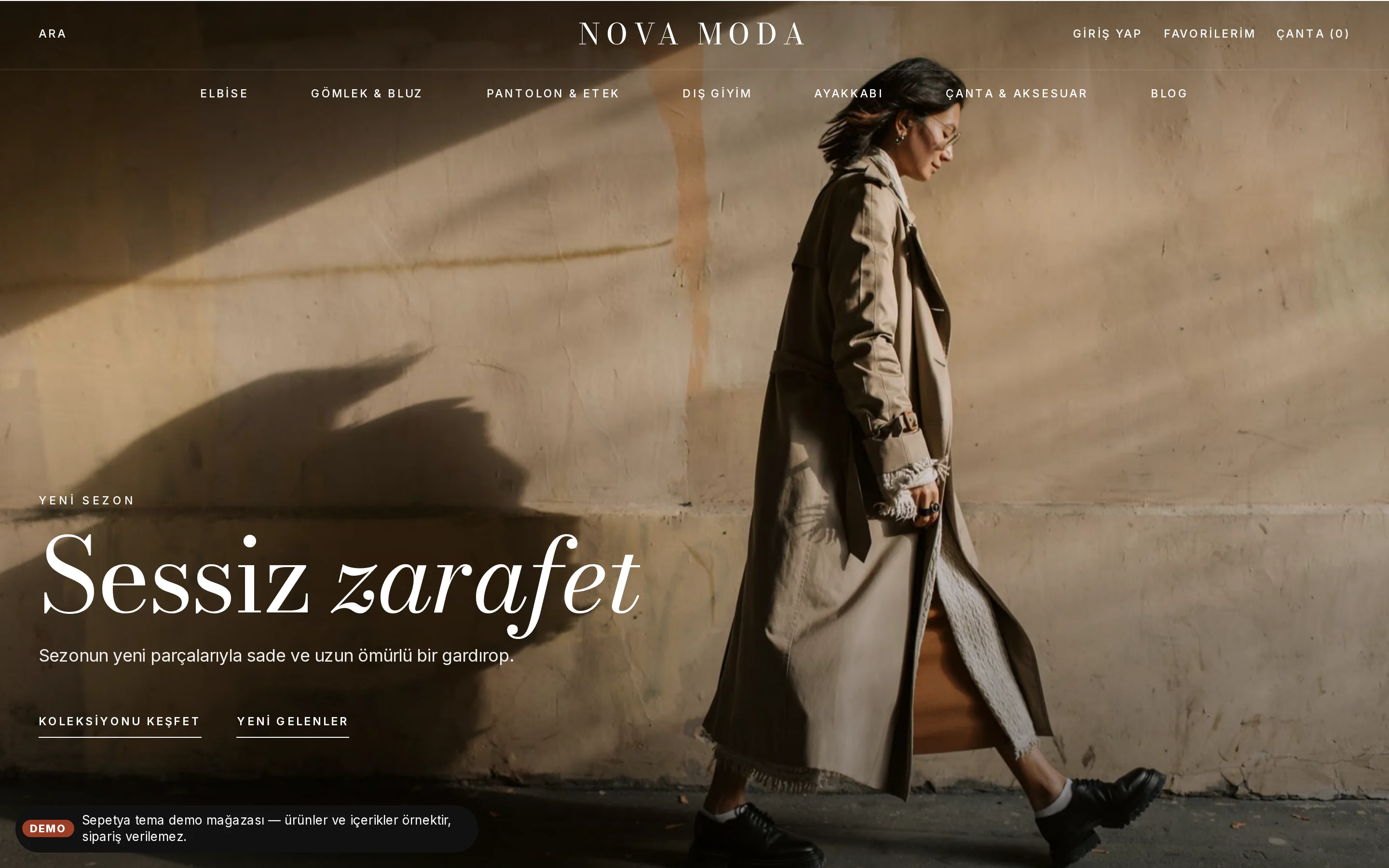
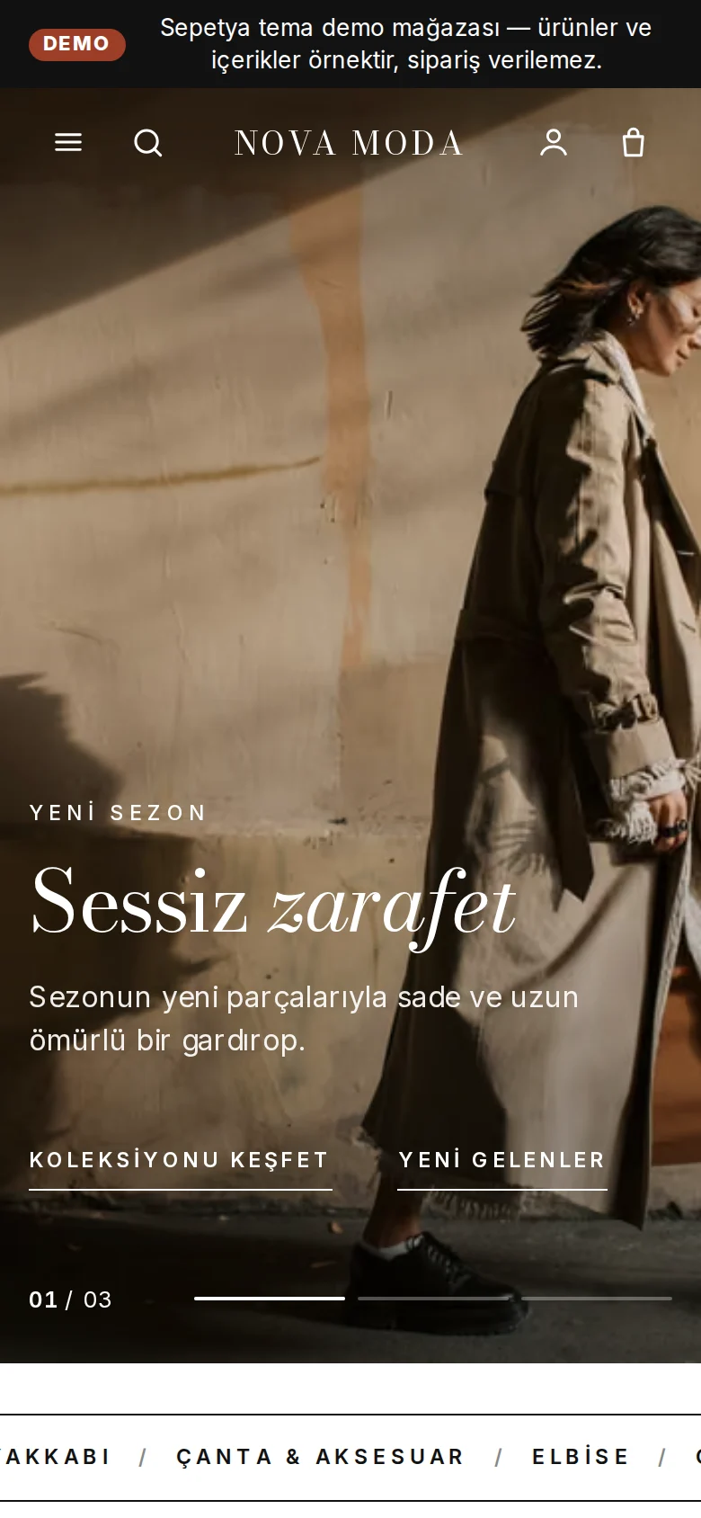
Reads like a fashion magazine: a transparent header over a full-screen campaign, large serif headlines, shop-the-look pins and borderless portrait product cards. For apparel, shoes and accessories.
Themes
Each theme is more than a colour change: it comes with its own header, opening, product card and footer. Open a demo store to look around, then adapt the one you like to your brand in the theme editor.
Compare the themes side by side. You can open the demo of any theme whose demo store is published; the demo content is sample content and orders cannot be placed in a demo store.
Showing 8 themes
Fashion and apparel
Reads like a fashion magazine: a transparent header over a full-screen campaign, large serif headlines, shop-the-look pins and borderless portrait product cards. For apparel, shoes and accessories.
Multi-category store
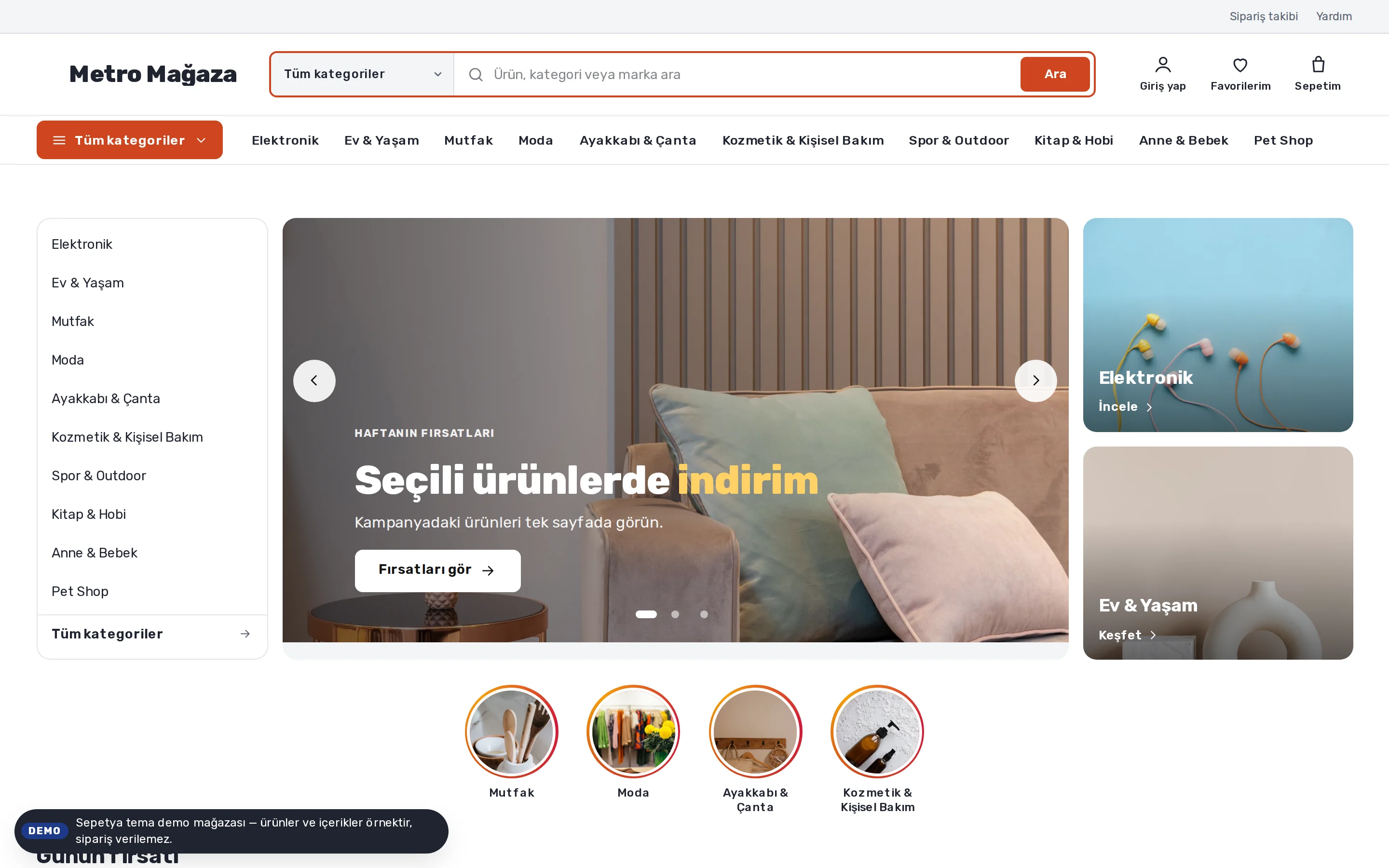
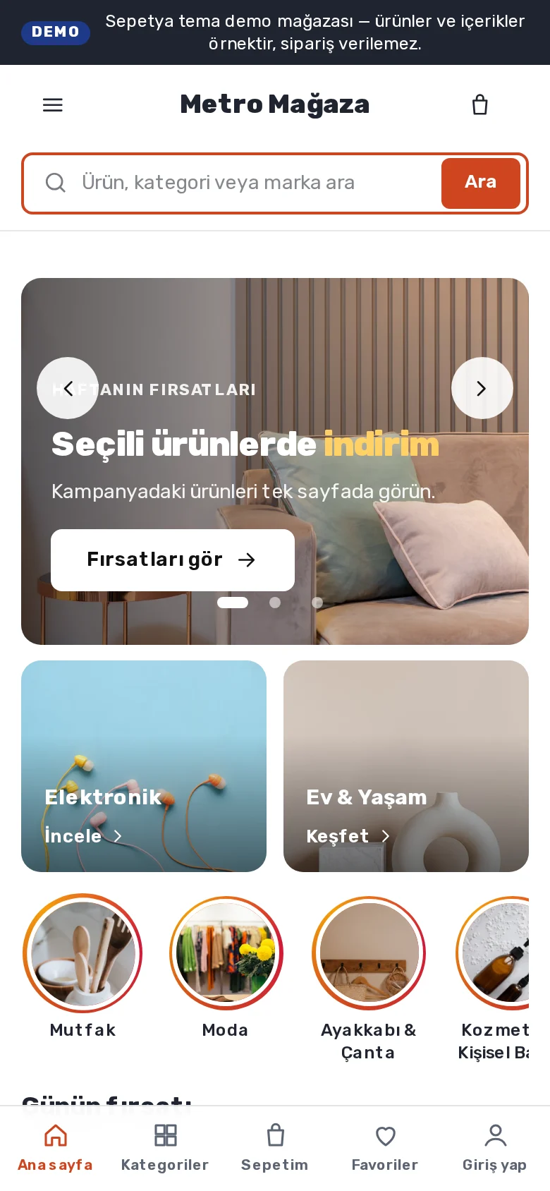
A large multi-category store layout: scoped search, an "All categories" menu, a campaign opening with the category list, story shortcuts, deal of the day and cards with an always-visible add button. For large catalogs.
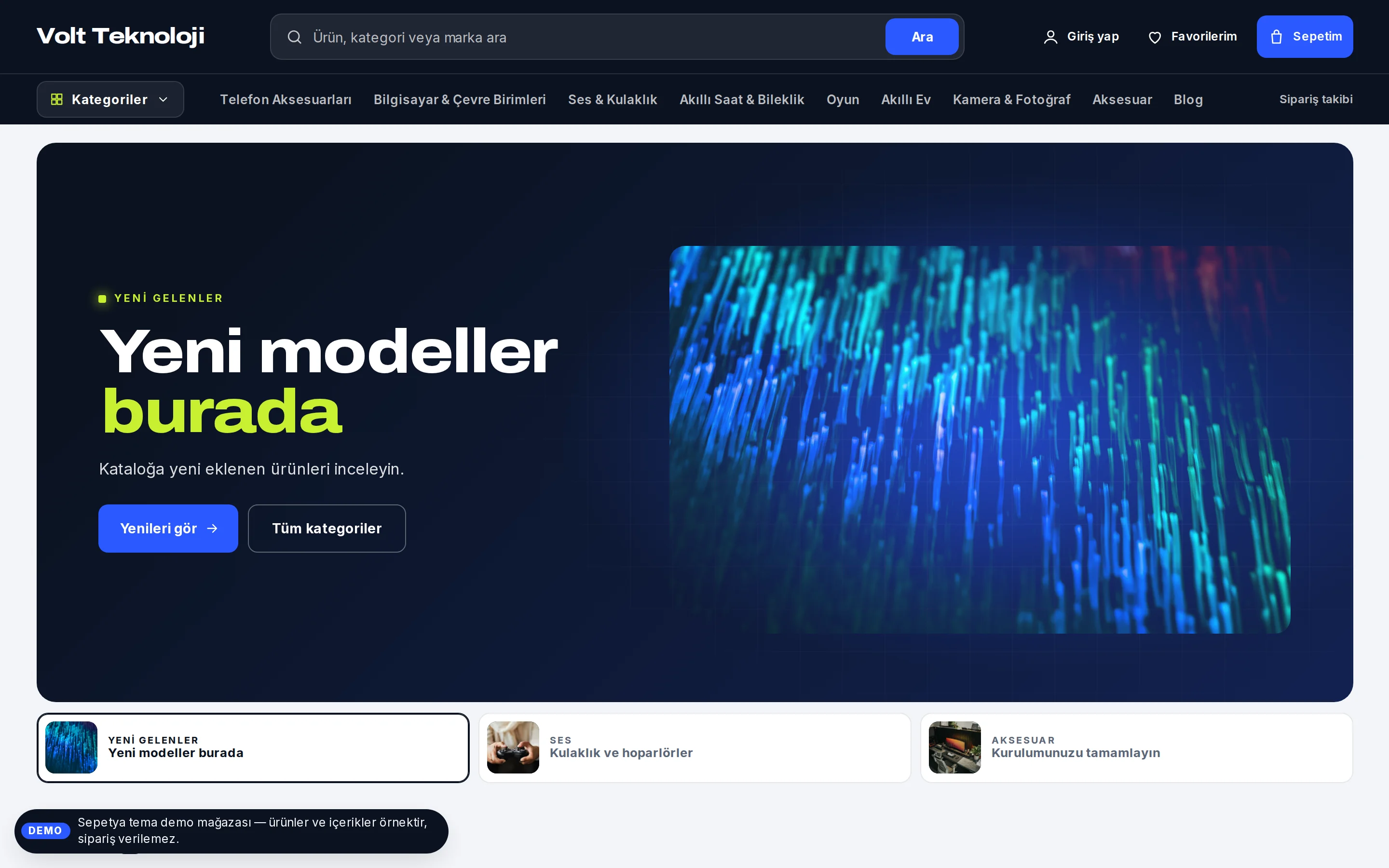
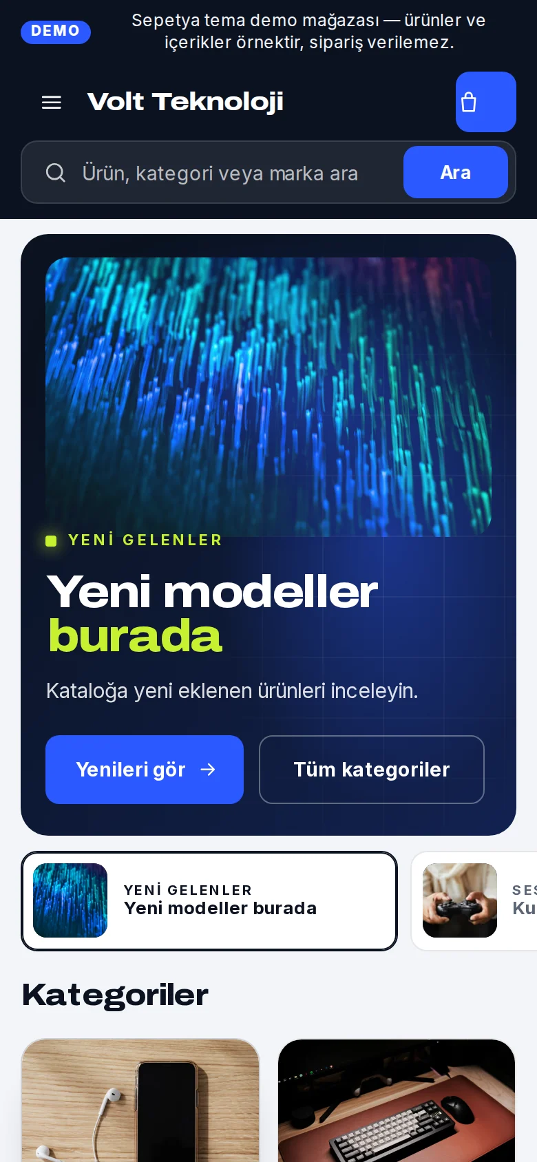
Electronics
A technical showcase: a dark header with a centred wide search and a vertical-tab category menu, a "spotlight" slider that puts the product on a dark stage, and white product cards with stock status and a one-tap add button. For electronics, computer and technology stores.
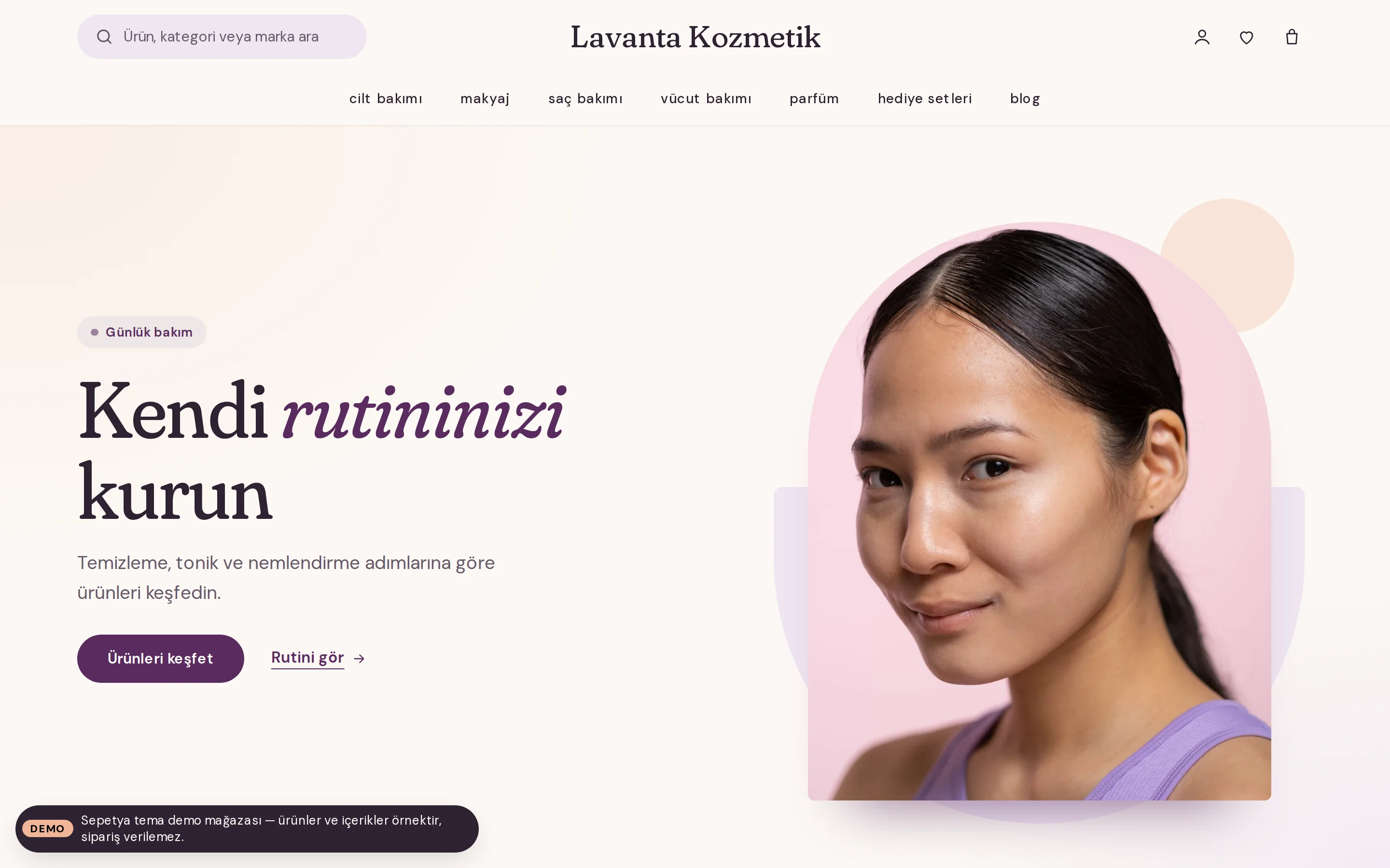
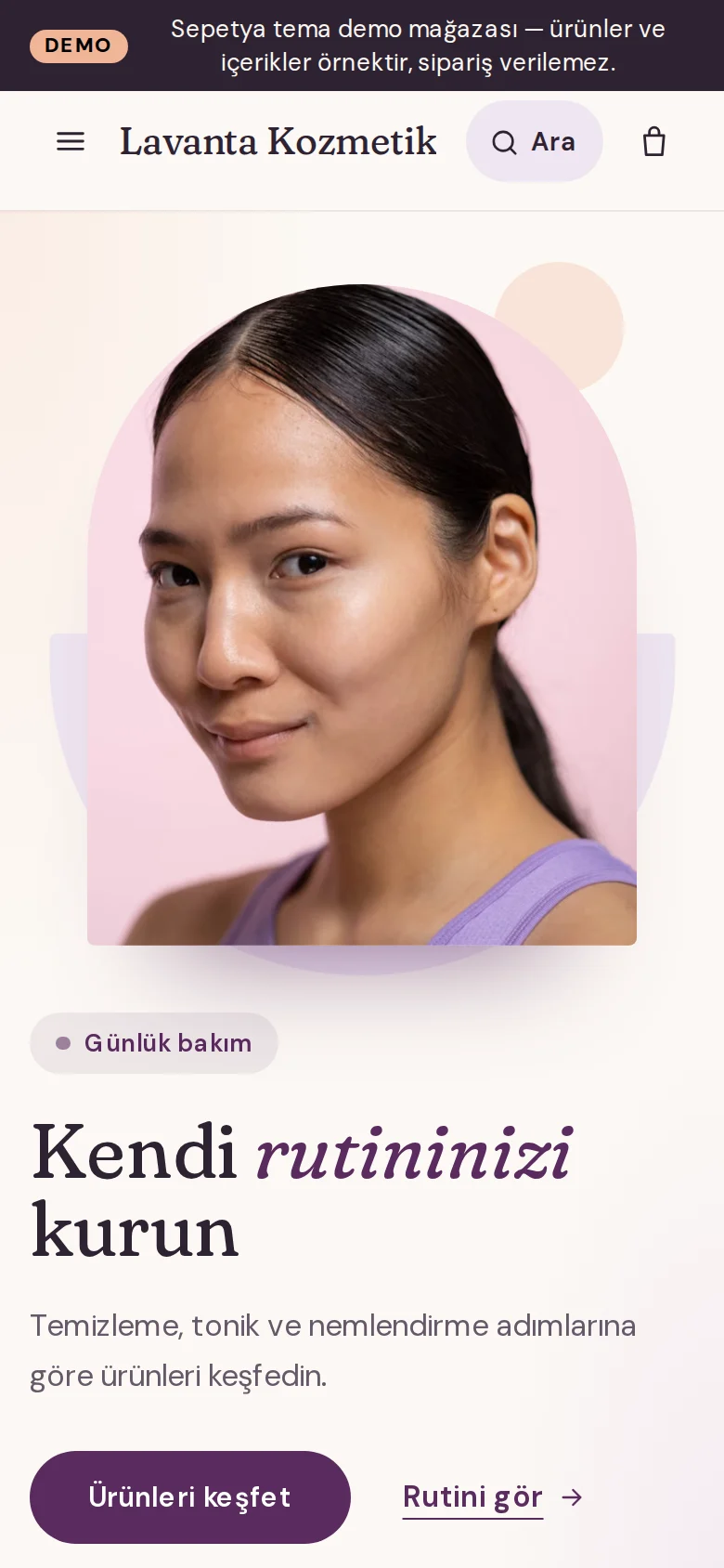
Beauty and personal care
Calm, airy and rounded: a rotating announcement strip, a split opening with an arch-cut image, skin-type shortcuts, a product-linked care routine, an ingredient glossary and approved reviews. For beauty and personal care brands.
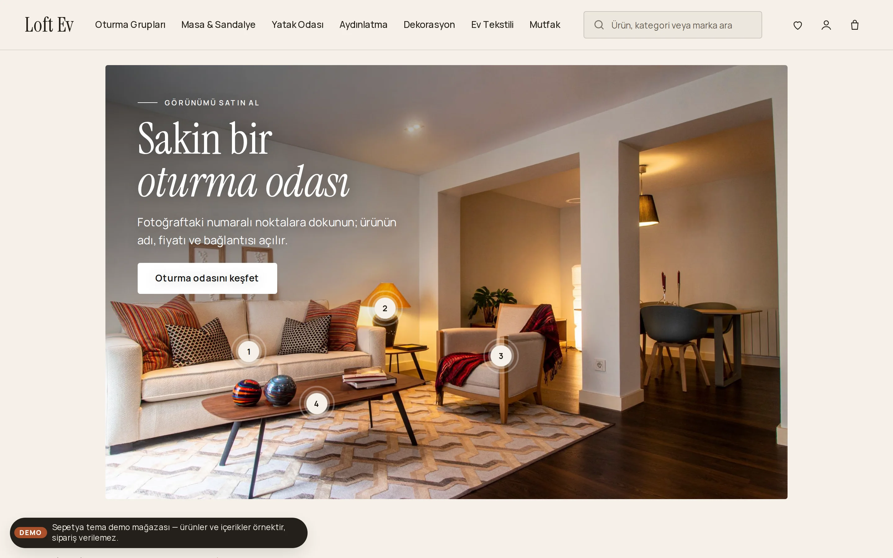
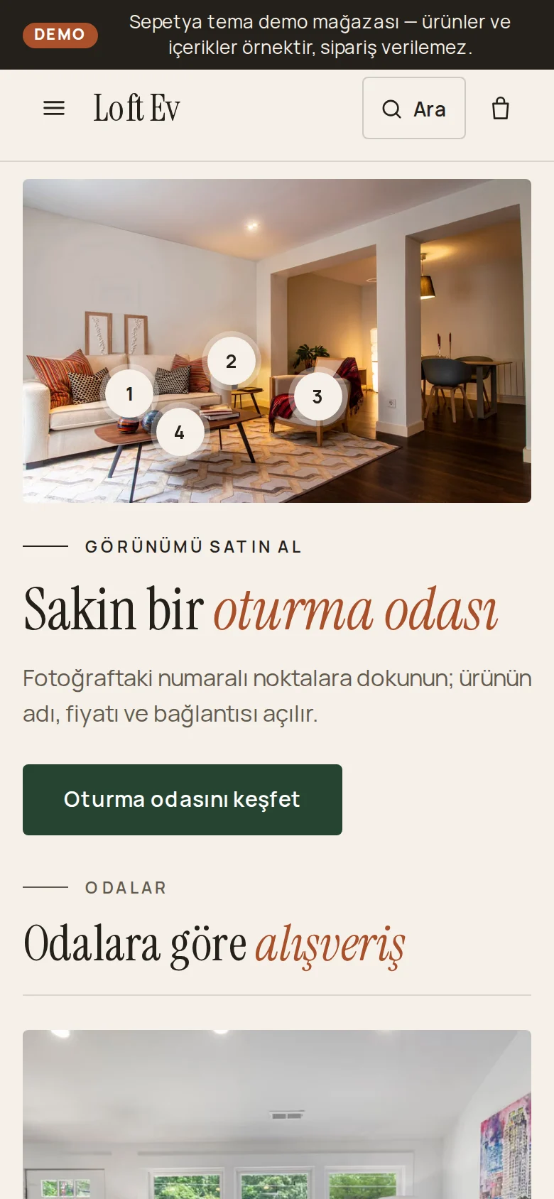
Home and living
Calm and warm like a gallery: an opening room photo with shop-the-look pins, a mega menu with room images, a rooms mosaic, a materials and craft story, an inspiration gallery and "from order to your home" steps. For home, furniture and decor stores.
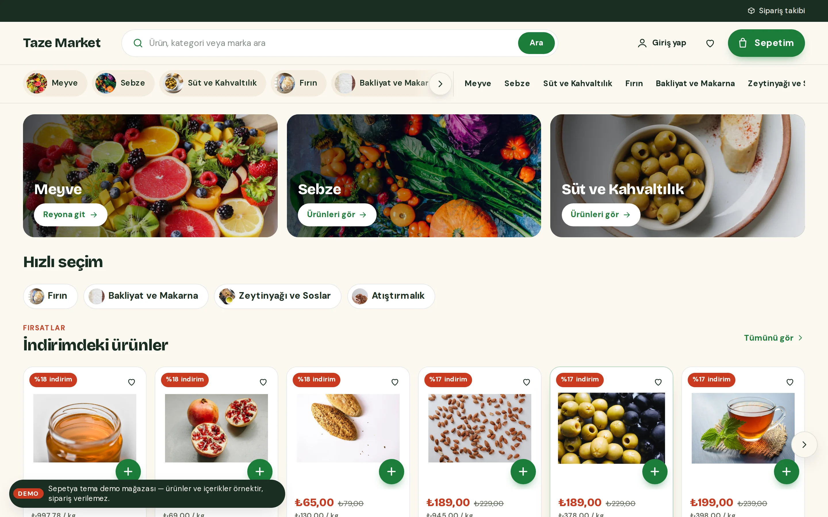
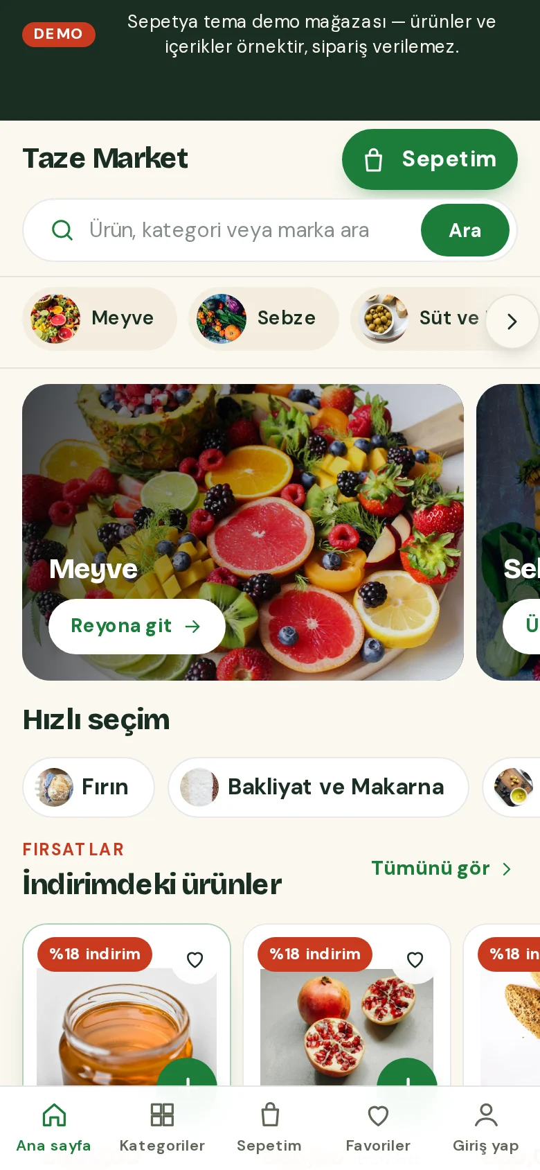
Food and grocery
A fast market: a delivery info strip, wide search, a cart button with the subtotal and sticky aisle chips; compact promo cards instead of a giant hero, product cards with unit prices and quantity steppers, a bottom tab bar and a floating cart summary on phones. For grocery, deli, gourmet and organic stores.
Jewellery and accessories
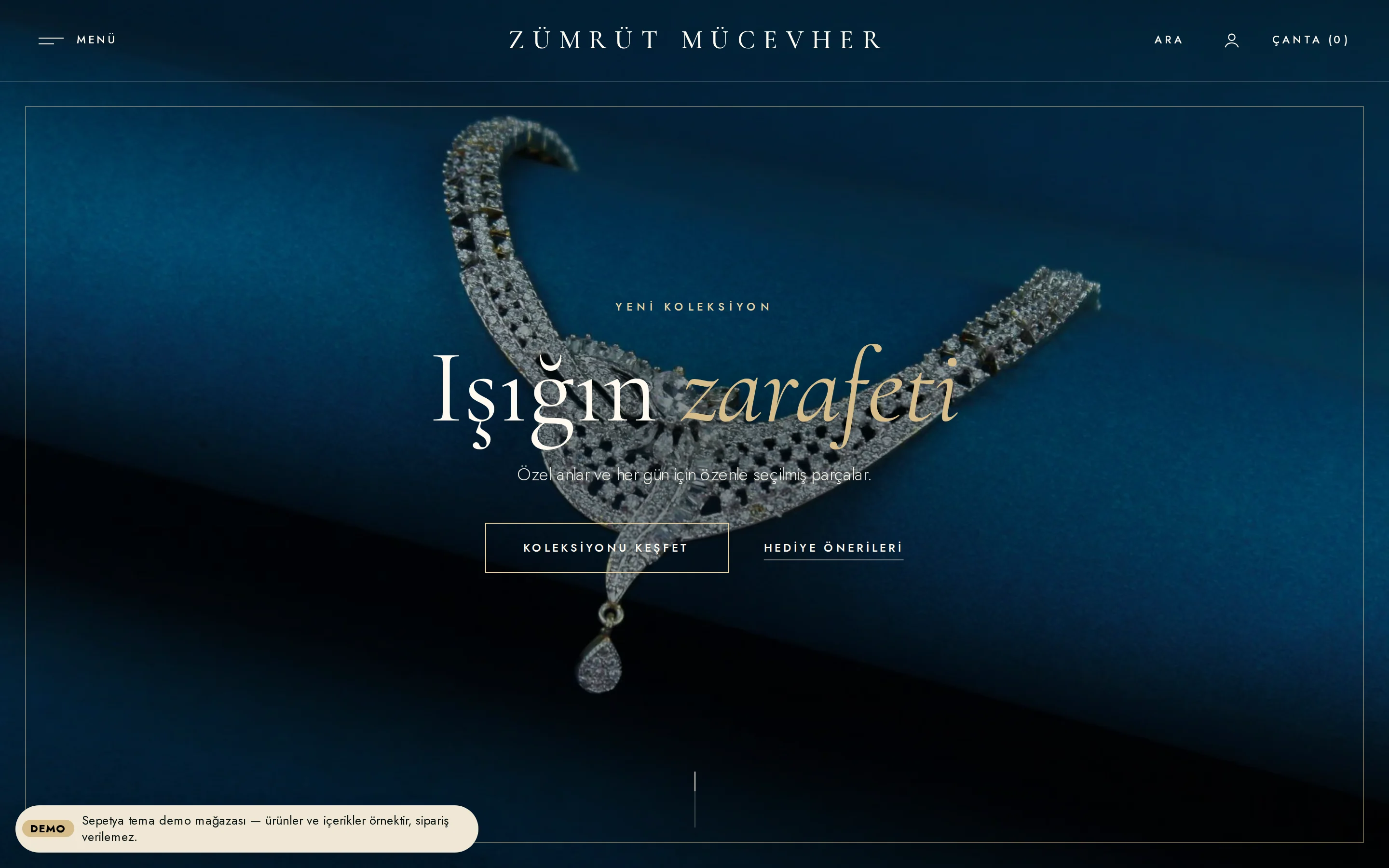
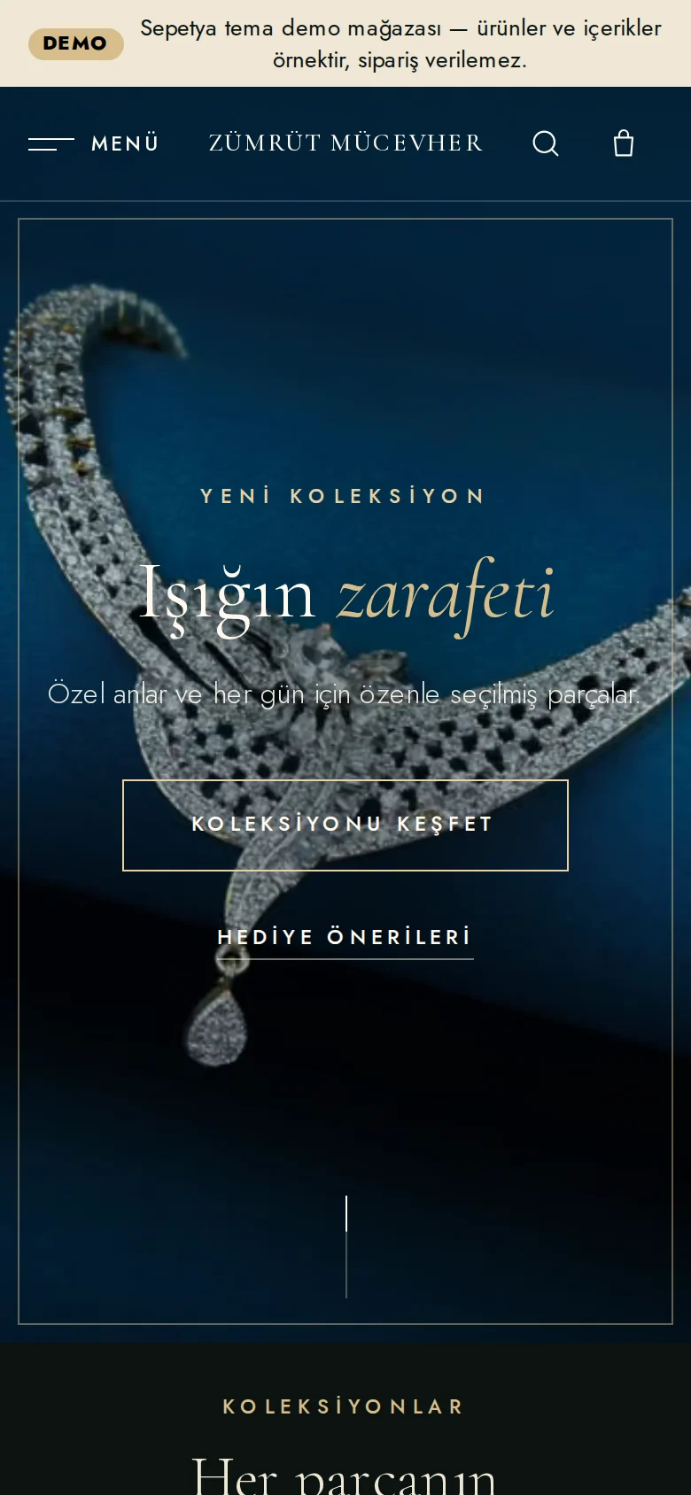
A dark "maison" for jewellery, watches and luxury accessories: a quiet header that floats over the opening, a "Menu" side panel with large serif links, a full-screen opening with video or a slowly zooming image, numbered collections, a craft story, a gift finder by budget and person and an appointment band.
Kids and toys
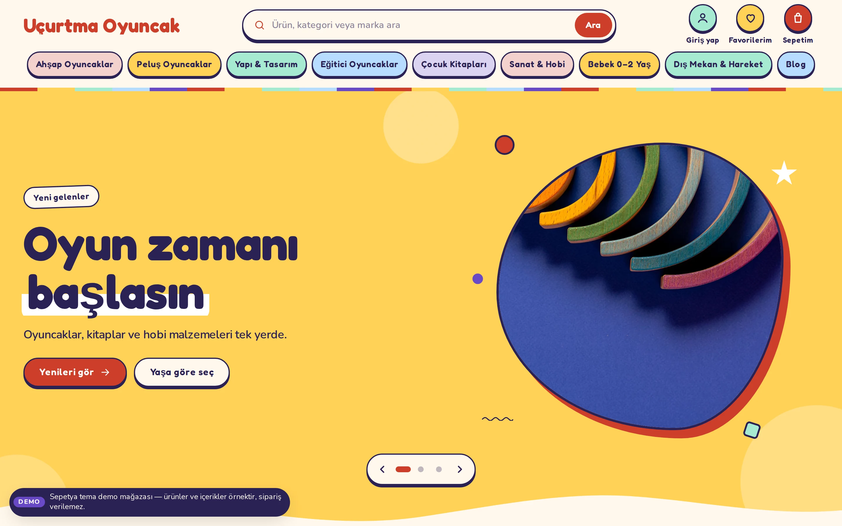
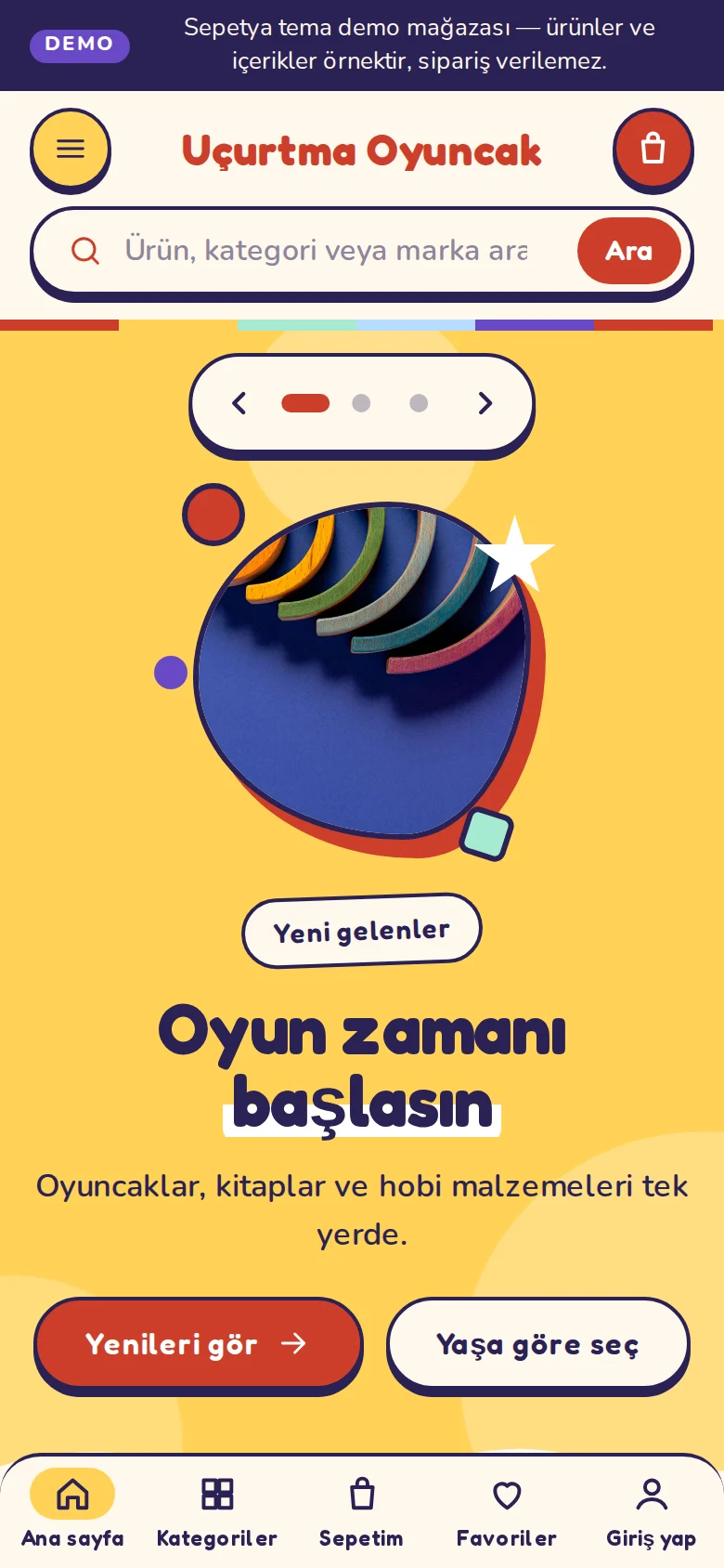
A cheerful but tidy playground for kids, toys and hobby stores: a colourful strip and rounded search, colourful menu chips, a bouncy slider with blob-masked photos, wavy section edges, shop-by-age bubbles, a gift finder, a parent guide and a bottom tab bar on phones.
Products and content in demo stores are samples; orders cannot be placed in a demo store.
Common to every theme
Seller details, legal pages and cookie preferences appear in every theme's footer, and the contract confirmations at checkout work the same way in all themes.
ComplianceCountdowns only run to the real campaign end you enter, stock warnings come from real stock and discount percentages from the old price you enter. Reviews are only approved, real reviews.
Search is always reachable and touch targets are generous; some themes add a bottom tab bar and a floating cart summary on phones.
Visible focus, keyboard navigation and the reduced-motion preference are design rules. Sliders never advance on their own on phones and pause on hover on desktop.
Structured data on product pages, the automatic sitemap and meta templates work the same way even if you switch themes.
SEO featuresYou use the same section library in every theme: video, FAQ, map, newsletter, gallery, coupon cards and more. Each theme also brings its own signature sections.
Theme editor
In the editor you see the page's section tree, the live preview and the settings of the selected section together. You add, reorder and hide sections and change colours, fonts and corner radius.
Every change first stays as a draft: you check it in the desktop, tablet and phone preview, undo it and publish when you are ready.
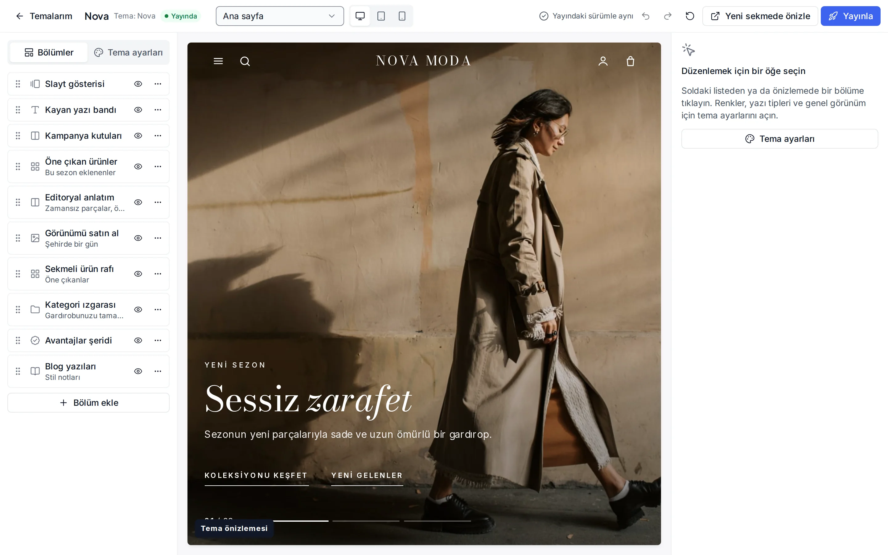
What is in the editor?
Each tab describes a real feature of the editor; you never have to write code.
You build a page from sections: opening, product shelves, category grid, video, FAQ, map, newsletter, gallery and more. Each section has its own settings panel, and you pick products, categories and blog posts from a list.
You change eight colours (primary, accent, background, surface, text, muted text, sale colour and text on primary), the heading and body fonts, base font size, heading weight, corner radius and button shape. Every theme has ready-made colour presets.
Switch the preview between desktop, tablet and phone widths. For sliders and openings you can choose a phone-specific image. Check every device before you publish.
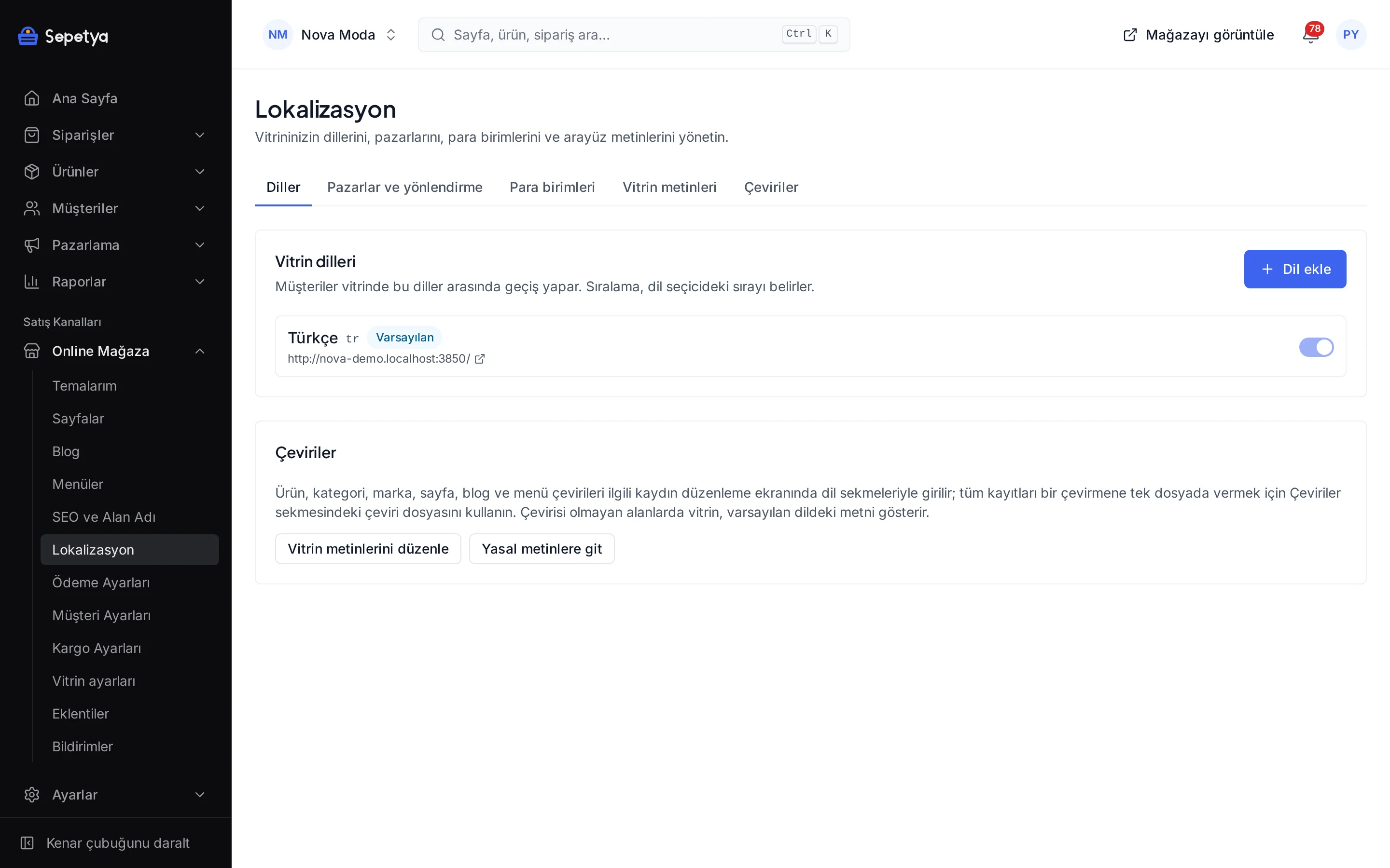
You enter section texts separately in each of your store's languages and switch the content language in the editor to preview each one. You can also translate the storefront interface texts by exporting and importing a CSV.
Changes are stored as a draft and do not reach the storefront until you publish. If you make a mistake you can undo it, or reset the template, the settings or the whole theme to its defaults. Themes you install stay in your library with their settings; you switch by publishing another theme.
Yes. You can open the demo of any theme whose demo store is published from this page or from the theme gallery in the panel. Demo stores are full of sample content, clearly marked as “sample content”, and orders cannot be placed in them.
The theme card shows the price: free themes are installed directly and paid themes are bought once per store. A theme's price is separate from the plan fee and can change; the current price is always on the card.
No; theme code is not edited by store owners. You change colours, fonts, layout and sections in the editor. If you need an extra script on the storefront, you can add it with the custom script feature and choose its cookie consent category.
No. Products, categories, brands, pages, the blog and menus are independent of the theme. When you switch, only the look and the home page layout change. Every theme you install stays in your library with its own settings, and the published one is active.
All of them work on phones, tablets and desktops. Search is always reachable, and the multi-category, grocery and kids themes add a bottom tab bar on phones. Sliders do not advance on their own on phones; you swipe through them.
Yes. You enter theme content separately in each language and turn on the language and currency switchers on the storefront. Multiple languages and multiple currencies are plan features; see the pricing page for the plans that include them, and languages and currencies for details.
Browse the demo stores, install the theme you like and adapt it to your brand in the theme editor. No credit card is asked during the trial.